Thursday, 13 December 2012

DigiPack - Deciding which layout to choose


8 Sides - This fold away Digipack would be ideal if my music video song was part of an album as I would be able to give deatils about the songs and artist's with all the space on the inside. However, as Folding Stars is a single I feel 8 sides would be 'too much' for what is needed.

This simple layout is a 4 sides DigiPack, an easy fold open Digipack which does not allow a lot of room for additional information.

I have decided to choose a layout that gives me the best of both worlds, this 6 sided layout will allow me to place the CD in the very centre of the design. I like how the two remaining sides are on the left and the right so when they are opened (to reveal the CD) it is almost like a pair of stage curtains opening to reveal the band: 

Wednesday, 12 December 2012

DigiPack - Researching Rock Band's Digipack's


For Biffy Clyro's single "Mountains" includes a piece of artwork - this is an option for when I create the album cover of Folding Stars. However, I need to be consistent when creating all sides of my Digipack and to have an piece of my artwork for the front and pictures for the other sides would be inconsistent and not work. Therefore, I am predicting that I shall be using photographs in my DigiPack.


Alternatively I could take a cover photograph such as this (Only Revolutions) where I would be able to go out and direct the composition of a picture and potentially edit it.


The Beatles - The white album


As well as being one of the bravest album covers of all time this is an album cover that uses clear iconic meaning as the album name is the white album and the album cover is pure white. Therefore I could use this as an idea for my DigiPack where I would take the name of the single (Folding Stars) and create a literal cover of a someone folding some kind of star.


Furthermore, I do like the cover of the single "Let it be" by the Beatles. The simple layout shows each band member - something that is important in the rock genre. As my three band members are the main focus of my music video (for the majority) I may use this cover as inspiration.
I would certainly like to create a Digipack which is inspired and aesthetically similar to an existing famous one, such as these:


Sunday, 28 October 2012

DigiPack - Researching Digipack's Covers


David Bowie's Aladdin Sane album cover is an incredibly simple one. However, it really does say a lot about the artist. The simplicity of it suggests that his record label have confidence in him. The font used is similar to the one I used at the very begging of my music video - formal and bold. The Digipack includes the artists name as well as the album name - in the centre, under the focus of the cover. This deviates from the "rule of thirds" whereas the words "David Bowie" do follow the conventions of the rule of thirds. The overall focus of this Digipack is the artist. David is the centre and by far the largest object on the cover. I hope to achieve this when creating my Digipack.


Adele's latest album - 21 is also very simplistic. The use of black and white creates a sophisticated image while giving us the impression the music in the album is calm and soothing. If the colours had high saturation levels (such as bright yellow and pink of the album by the sex pistols - never mind the bollocks) then it is suggested the music in the album is also fully of energy and excitement. This album cover also includes the artist's and album name - both a recurring theme - they are essential pieces of information that I must include in my DigiPack. In addition, as my single DigiPack is an energetic and fiery song I hope to also use such vibrant colour schemes.


BBC Radio 1 Playing my Music Video


I sent in my final cut of my music video to the BBC radio 1 show where people can either:

1) Listen purely on the radio (sound only)

2) Watch the presenters and the music videos sent in - live in the studio (visuals and sound)

Unfortunately, I am only able to access the audio:


My Finished Music Video - 'Folding Stars'

Editing my Music Video - Final Checking (myself and friends) & Exporting/Uploading to Vimeo

Before exporting my music video I wanted to have one final check/run though to see if there was anything I needed to change. I asked just a couple of friends to come into the editing suite and take a look as I was most likely 'too involved' in it, and might have missed some obvious mistakes that someone with a fresh eye may easily spot. I spotted a hidden mistake that I hadn't noticed when working on it and watching it all these hours.

My mum who was there on the day of filming at the Church is in one of the shots - in the shadows:


However this is an important shot and one of my favourites and I didn't want to take it out. I attempted to edit her out but that did not work very well. So, I have decided to leave it in, if I wanted to see from the meaning/representation perspective, perhaps I could interpret it as the ghost of 'Elenor'.

After exporting my video I attempted to upload it to Vimeo but the file size was too large so I had to decrease it slightly (impacting on the quality). Then when I did upload it the proportions/ratio was wrong and the video appeared 'squashed' so I had to export from Adobe Premiere Pro using different settings.


Editing my Music Video - Nearing Completion/Final Touches

I changed the speed of numerous shots to get my lip sycning as accurate as possible. I also increased some of the contrast levels to make the colours of the video appear brightener/darker. I was able to fine tune any parts by zooming into the timeline and making the necessary edits.


One of the major final touches I made was changing the speed of the 'teleportation moment'. The speed of the man's hands moving were not matched, the speed of the hand wiping the house was faster than the one in the Church. Therefore I had to either speed up the Church one or slow down the home one. I decided to do the latter. However, I could not simply choose the correct part of the shot and slow it down (to roughly 70%) otherwise it would be clear to the audience that that particular clip had been slowed down. So instead, I choose the first part of the wiping action and reduced its speed to 90%, then the second bit I changed to 80%, then the third 70%. This created a far more subtle/smooth effect:


Editing my Music Video - Adding Narrative Shots

As I had done most of the work the previous week all I had to do was put the necessary shots into the gaps in the timeline after lowering the saturation and applying the letter box cinematic effect (I have learnt from editing the Church footage that this is a great way to save time) - apply the effect before cutting the raw footage.


I found the feature to zoom into the timeline the most useful feature. I was able to precisely edit to each frame. I was able to again use the "c" (cut tool) and the "v" (select tool) to choose certain parts of my footage from the house and insert them into the gaps of the footage filmed at the Church.

Editing my Music Video - Adding the Title of the song


Originally, I had my title of the music video and artists like this (see right) however, I felt this was very similar to the conventional way to introduce a music video and I wanted to challenge those norms just like Ne-Yo has in his music video - one in a million (see above). On a solid black background using strong white writing (in capitals).


First I had to create the title, name it and then design it, in the new window I was easily able to edit the font, add separating lines for effect, change the size and add a red coloured glow:


My Band's Logo

I have created this simplistic, bold logo for my band "Biffy Clyro". The logo includes the letter "b" and "c" - the initials of the band. Furthermore, the overall shape is reminiscent of a musical note called a quaver. This is appropriate as they are a musical band. I used the black stripes to cover the top of the quaver to leave the the "b" and the "c" letters visible. In addition, I hoped the stripes would give the logo character while suggesting the band are modern and energetic.


I mirrored the image and added two white circles to create the letters.
After mirroring the image of the quaver, I added the stripes and rotated it so it covered most of the right side and little of the left side to make the "b" and "c" effect.
Finally, I reversed the colours so the black became white and visa versa. I then added a slight hint of sky blue to bring it to life.

Production Company - Logo

I have decided to change the name of the music video's production company to Neo Productions which means new. I believe the shorter name sounds far more modern and catchy:


Production Company - Animation

The following animation I have created is one that ties in with the name. After the two words separate, they converge into one:

Production Company - Name

I have decided to have the company producing my music video to be called Convergence Productions as this could either mean companies converging and working together or new technology and media converging.


The Day of Filming - Narrative


One week after filming at the Church I filmed the narrative shots in my house using the actors described in earlier posts. I wanted to film my little bother an sister first due to the fact they will become more and more tired throughout the afternoon/evening. However, when filming it did not work out exactly like this. The children were not in their pyjamas until 7pm so I made a start on filming my dad

First I set up the lights in the kitchen and directed my dad to lean again the fridge and drink, we then filmed his pouring the drink that he had just drank


When filming his cry I wanted to film an over the shoulder shot so the audience could see the photographs he was looking at. Then, with a low angle shot we can see his reaction and facial expressions.

Directing the children was incredibly difficult as they did't always listen. For example, originally, the young boy was going to spill the drink (and then get shouted at) but when being shouted at he wouldn't stop laughing. Therefore I used my little sister instead who was also more likely to make the cup accident appear more realistic.

I took numerous other shots such as close ups of the letter being written, the children fighting (and their father breaking it up), and the father crying.

For each shot I had to change the lighting to create the desired effect. In addition, I am glad I did a few of rehearsals before the day of filming to help move things along on the day of filming:


Deciding not to film the Band in a Second Location

I was planning on filming the band playing in a second location (either the fields overlooking London or the rubble site) but I feel the Church has given me more than enough footage to work with. In addition, the simplicity of just the Church is one I feel my audience will remember.


Editing my Music Video - Editing the Band's Performance alone

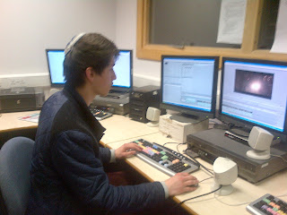
After uploading my footage I made a start on editing. I imported the mp3 file/song - Folding Stars as this will give me the beat/lyrics to base my editing around. I had roughly 2 hours of footage from the Church (one hour of the grieving man shots and the other hour of the band playing in the Church). I had to watch the two hours to refresh my memory. Soon after, I dragged them onto the timeline and started to make cuts when I found a match with the song (such as a line sang) and when the instruments matched up with the song, such as the drum beat. I was able to use this window (see above and to the right) to play, pause and rewind. However I preferred using the buttons on the keyboard as they were easier to access:


I slowly began to fill more and more of the space with small pieces of the band playing in the Church. However, I did not have enough shots of the main artist singing so I had to look especially hard for those even a couple of seconds worth.


I could easily adjust the brightness and contrast levels to make the colours appear 'richer'.

I felt the beginning was too abrupt so I dragged in a "cross dissolve" transition and then decreased it's size.

As my music video has a narrative I wanted to make my music video look aesthetically similar to a feature film. In addition, I also feel it makes my video look more professional. I was able to create the letter box effect using the "Four-Point Garbage Matte" where I could either move the four points with my mouse or type in the coordinates to each clip.


In hind sight I should have applied this effect first to the whole piece of raw footage. Instead, I had do each clip individually which took up a lot of time. One could also look at it from other perspective and ask why Adobe Premiere Pro does not have a feature which allows you to apply one effect to many clips.


I want slightly more than half of my music video to be the band playing (especially on the choruses) however, for now I have filled in half of the timeline with 2/3 second clips of the band. I want to film and add the narrative and then see what it looks like before I do too much.


For the past week/5 days I have been editing during school, in lunch breaks, free periods and media lessons as well as after school (when I get a lot of work done) when I stayed until roughly 9pm/10pm.