I then layered the teardrops on top of this image after creating a new 'layer'. I used this photograph of blood dripping and changed the colour to blue:


Finally, I added one pink circle, lowered the opacity/transparency so it was half-see though. Then I copied and pasted this shape 10 times. Lowering the opacity first saved me having to go through all 11 circles changing the opacity to the same percentage each time. Then the final touch was the title, I was able to experiment with fonts and colours. This is my final outcome:

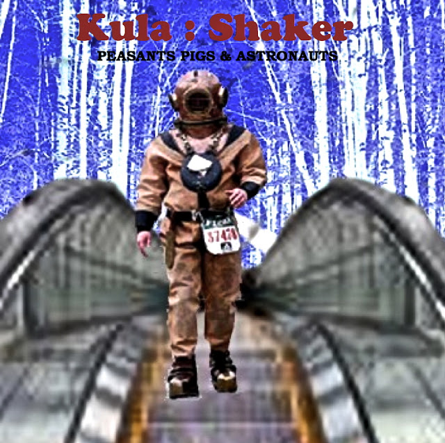
As I had learnt so much about how to use the software from my first 'mock Digipack cover' I wanted to try and see if I could duplicate a slightly more complex design:
Firstly, I used the magic wand crop tool to delete the appropriate parts of the escalator image (downloaded from the internet) to delete the upper section. I was able to feather the edges so they blurred slightly to avoid a blatant editing crop.
I then had to replace this empty space of the 'canvas' with the cold blue coloured image of the woods like the one in the original. I took the following image and adjusted/reversed the colours balance to create the effect of blue woods - similar to the harsh coldness of the original Kula Skaer album cover. I simply added a new layer and placed this underneath the edited escalator image.

Penultimately, I used the magic wand crop tool once again to cut the outline of the spaceman body to then layer this on top of the previous two layers. Finally, I added the text on the final forth layer.


No comments:
Post a Comment